How to Make a Style Guide
BlogPublished on April 1, 2026
A style guide is a document that shows different handwriting styles and explains when to use each one. It helps you choose the perfect style for any project, message, or occasion. With our text-to-handwriting converter, you have access to 15 unique handwriting styles.
Each style has its own personality and purpose. Some styles look elegant and formal. Others look casual and fun. Some look like real handwriting. Others are creative and artistic. The right style makes your message more powerful. It adds personality. It catches attention. And it makes your audience feel your emotion. This guide explains each of our 15 handwriting styles so you can pick the perfect one every time.
The 15 Handwriting Styles: Complete Breakdown
Style 1: Cedarville - Classic & Elegant
Best For: Formal letters, wedding invitations, professional documents, sophisticated messages
Personality: Elegant, timeless, classic, refined
Vibe: Traditional handwriting that looks like someone with perfect penmanship wrote it. Flowing letters with consistent spacing. Very readable and beautiful.
When to Use:
- Wedding invitations and announcements
- Formal business correspondence
- Thank you notes from professionals
- Love letters and romantic messages
- Certificates and awards
- Formal event invitations
NOT Best For: Casual social media, fun messages, youthful content
Example Uses: "We cordially invite you to our wedding" or "Thank you for your business"
Indie Flower - Creative & Artistic
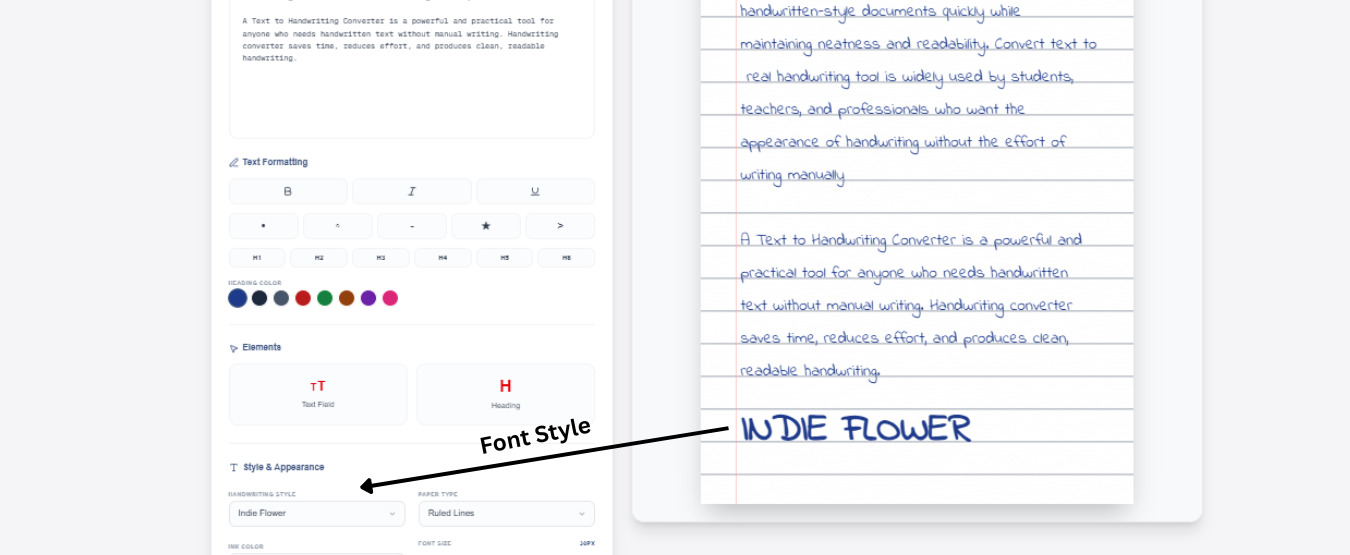
Best For: Creative projects, artistic designs, social media, gift ideas
Personality: Artistic, creative, unique, free-spirited
Vibe: Hand-drawn feeling with natural imperfections. Looks like someone sketched it by hand with artistic flair. Unique and memorable.
When to Use:
- Instagram captions and stories
- Creative social media posts
- Artistic projects and designs
- Pinterest pins and descriptions
- Greeting cards
- Poster designs
- Handmade gift labels
NOT Best For: Professional business letters, academic work, formal documents
Example Uses: "Create something beautiful today" or "Handmade with love"
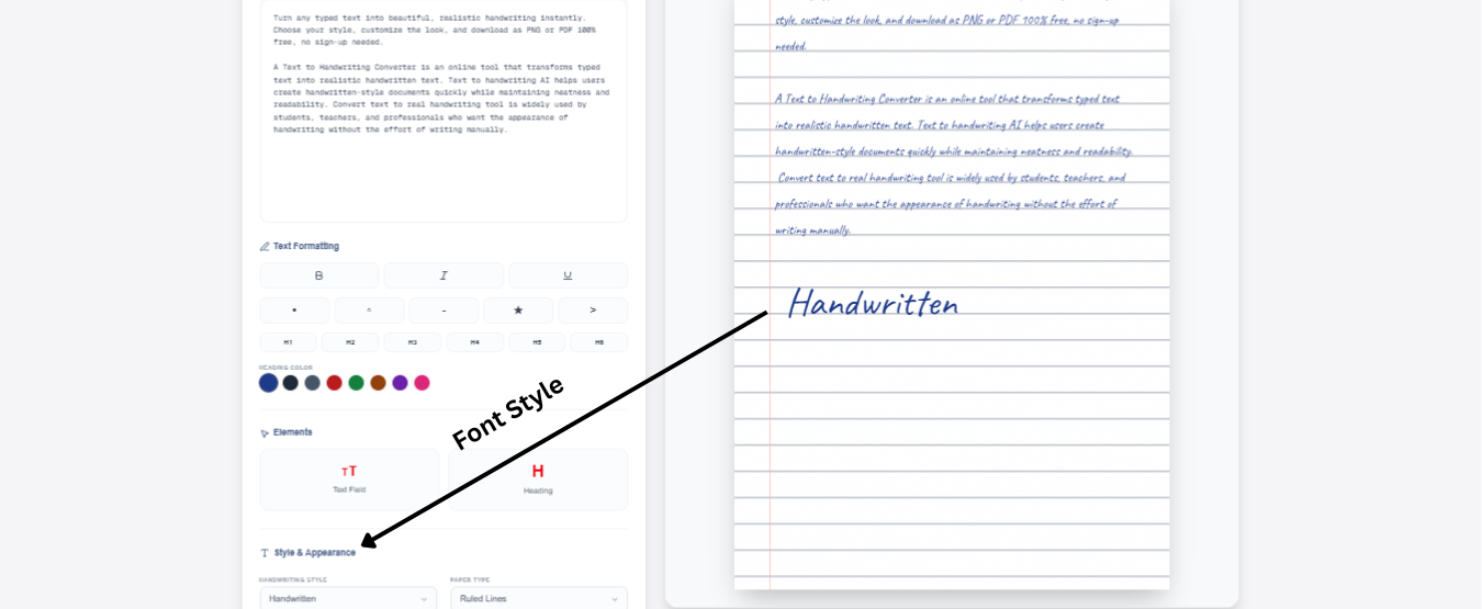
Handwritten - Natural & Authentic
Best For: Realistic handwritten look, personal messages, student notes
Personality: Natural, authentic, genuine, everyday
Vibe: Looks like genuine handwriting from a regular person. Not too perfect, not too messy. Authentic and real.
When to Use:
- Personal notes and letters
- Student assignments that need handwriting
- Note-taking for study materials
- Casual personal messages
- Everyday correspondence
- Simple handwritten cards
- Journal entries
NOT Best For: Formal events, graphic design, artistic projects
Example Uses: "Hi, how are you?" or "Don't forget to study chapter 3"
Neat Print - Clean & Readable
Best For: Professional documents, academic work, easy reading
Personality: Clean, organized, professional, clear
Vibe: Print-style handwriting that looks very neat and organized. Perfect spacing. Very easy to read. No cursive.
When to Use:
- School assignments and homework
- Professional documents
- Technical documentation
- Lists and to-do items
- Academic papers
- Office memos
- Instructions and guides
NOT Best For: Wedding invitations, love letters, creative social media
Example Uses: "Project Due Date: Friday" or "Instructions: Follow step-by-step"
Cursive - Flowing & Traditional
Best For: Traditional handwriting, formal letters, classic elegance
Personality: Traditional, flowing, connected, classic
Vibe: Connected flowing letters, traditional cursive style. Looks like old-fashioned handwriting. Very smooth and elegant.
When to Use:
- Traditional formal letters
- Classic wedding invitations
- Formal announcements
- Historical or vintage designs
- Elegant signatures
- Traditional thank you notes
- Classic literary designs
NOT Best For: Modern social media, casual messages, technical documents
Example Uses: "Yours truly" or "Please join us for dinner"
.png)
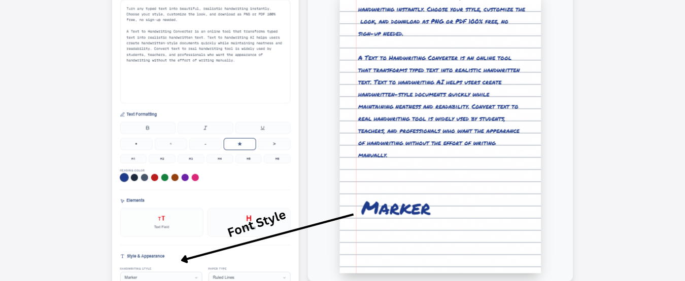
Marker - Bold & Casual
Best For: Casual messaging, fun projects, eye-catching posters
Personality: Bold, casual, friendly, approachable
Vibe: Looks like thick marker writing. Bold strokes. Casual and friendly. Easy to notice.
When to Use:
- Casual social media posts
- Fun announcements
- Poster designs
- Party invitations (casual)
- Greeting cards (fun)
- Game announcements
- Casual friend messages
NOT Best For: Formal business, elegant events, professional documents
Example Uses: "You're invited to a party!" or "SALE this weekend"
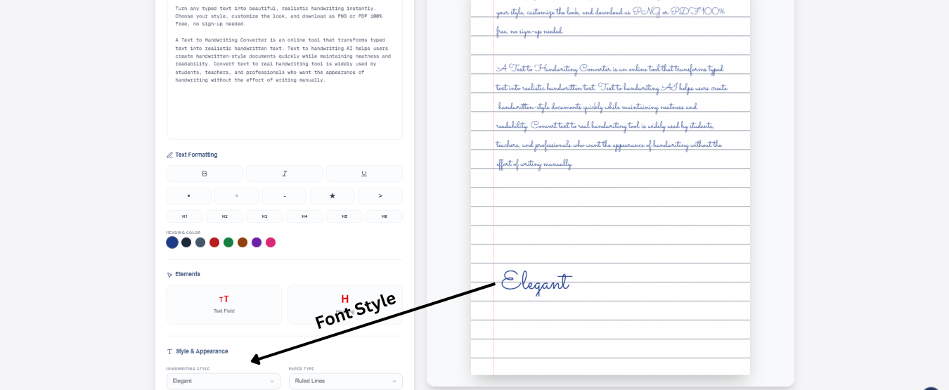
Elegant - Fancy & Sophisticated
Best For: Special occasions, upscale events, premium branding
Personality: Fancy, sophisticated, upscale, premium
Vibe: Flowing fancy letters with decorative flourishes. Looks very sophisticated and expensive. Premium feel.
When to Use:
- High-end event invitations
- Luxury brand communications
- Sophisticated wedding designs
- Upscale restaurant menus
- Premium product labels
- Fancy greeting cards
- Exclusive announcements
NOT Best For: Casual messages, budget-friendly projects, everyday use
Example Uses: "You are cordially invited to an exclusive evening" or "Premium Collection"
Playful - Fun & Youthful
Best For: Youth-focused content, fun social media, creative projects
Personality: Playful, fun, youthful, energetic
Vibe: Bouncy, fun letters with personality. Looks young and full of energy. Makes people smile.
When to Use:
- Fun social media posts
- Youth-targeted content
- Playful greeting cards
- Kids' project designs
- Fun announcement posters
- Casual birthday invitations
- Entertainment content
NOT Best For: Professional business, formal events, serious documents
Example Uses: "Let's have FUN!" or "You're awesome!"
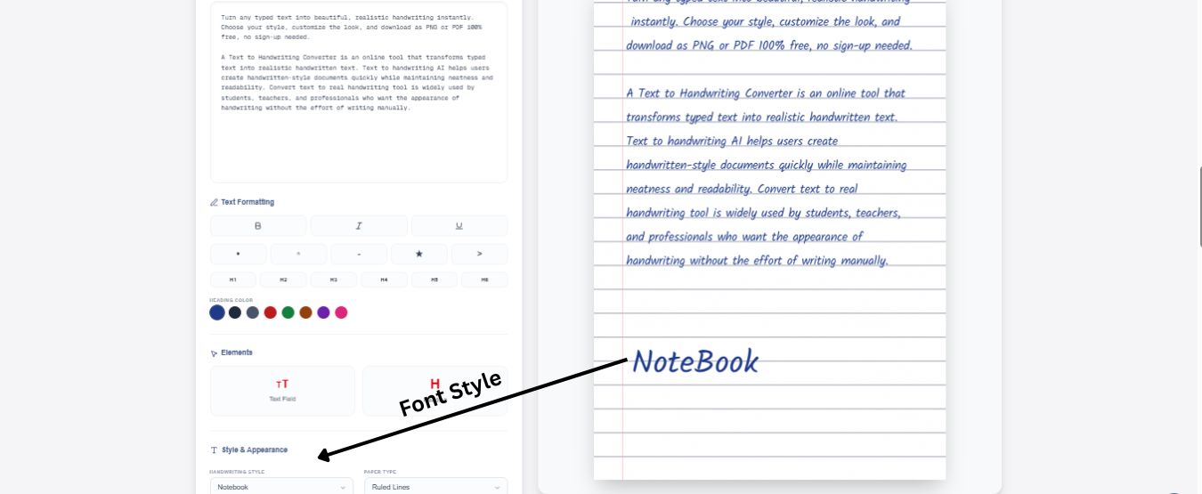
Notebook - Classic School Style
Best For: Student work, academic materials, everyday notes
Personality: Classic, student-friendly, academic, everyday
Vibe: Looks like writing in a school notebook. Simple, clear, authentic. Like real student handwriting.
When to Use:
- Student assignments and homework
- Educational materials
- Class notes
- Study guides
- Academic projects
- School-related work
- Textbook-style designs
NOT Best For: Creative social media, formal events, artistic projects
Example Uses: "Biology Notes: Chapter 5" or "Math Homework - Due Friday"
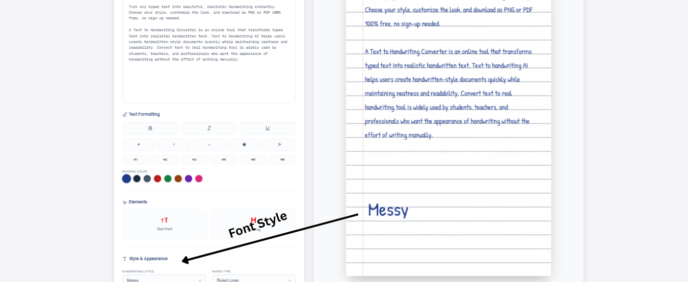
Messy - Casual & Authentic
Best For: Realistic handwriting, casual notes, authentic feel
Personality: Casual, authentic, real, imperfect
Vibe: Looks like genuine messy handwriting from someone writing quickly. Authentic and real. Has natural imperfections.
When to Use:
- Casual personal notes
- Quick messages to friends
- Authentic storytelling
- Real-life relatable content
- Casual social media
- Blog posts with personality
- Personal journaling
NOT Best For: Formal business, elegant events, professional documents
Example Uses: "Hey, just wanted to say hi" or "Quick reminder: don't forget milk"
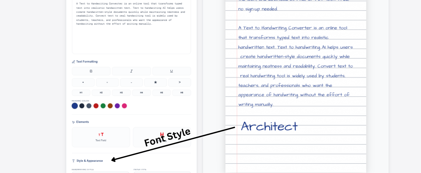
Architect - Technical & Precise
Best For: Technical documents, blueprints, professional designs
Personality: Technical, precise, professional, structural
Vibe: Looks like architect or technical handwriting. Precise lines. Mathematical feel. Structured and organized.
When to Use:
- Technical documentation
- Blueprint annotations
- Engineering documents
- Precise measurements and specs
- Professional technical guides
- Structural designs
- Mathematical equations
NOT Best For: Romantic messages, creative art, casual social media
Example Uses: "Specifications: Length 50cm x Width 30cm" or "Technical Blueprint"
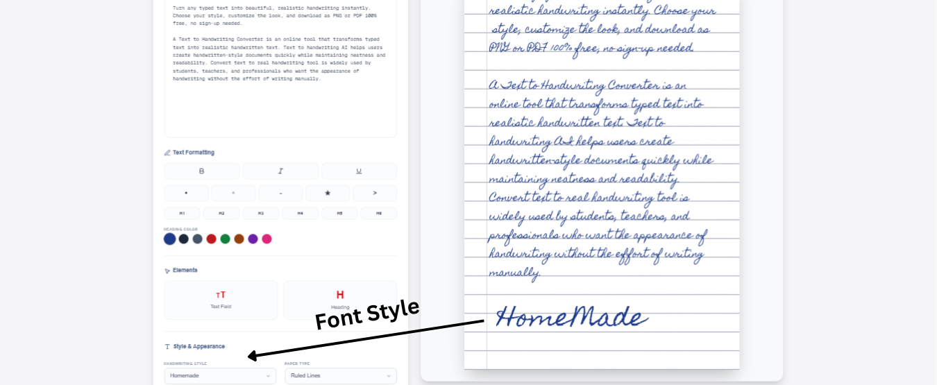
Homemade - Warm & Handcrafted
Best For: Handmade gift labels, artisanal products, personal projects
Personality: Warm, handcrafted, personal, heartfelt
Vibe: Looks like something made by hand with love. Warm and genuine. Has that personal "made with care" feeling.
When to Use:
- Homemade product labels
- Gift tags and labels
- Handcrafted product packaging
- Artisanal business branding
- DIY project labels
- Gift wrapping designs
- Personal craft projects
NOT Best For: Corporate branding, formal documents, technical work
Example Uses: "Handmade with Love" or "From our kitchen to yours"
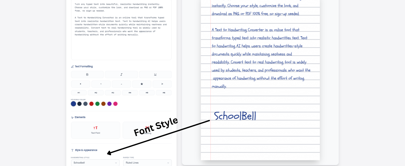
School bell - Young & Cheerful
Best For: Kids' content, educational materials, cheerful designs
Personality: Cheerful, young, educational, friendly
Vibe: Bright and cheerful like a school bell. Friendly and welcoming. Perfect for educational content. Approachable and warm.
When to Use:
- Kids' educational materials
- Cheerful announcements
- Youth-friendly content
- Educational posters
- Friendly school projects
- Child-focused designs
- Welcoming invitations
NOT Best For: Serious professional work, formal business, adult-focused, elegant content
Example Uses: "Welcome to class!" or "Learning is fun!"
Satisfy - Smooth & Modern
Best For: Modern designs, contemporary style, trendy content
Personality: Modern, smooth, contemporary, trendy
Vibe: Smooth flowing letters with a modern twist. Contemporary feel. Looks current and stylish.
When to Use:
- Modern social media content
- Contemporary design projects
- Trendy brand communications
- Modern invitation designs
- Stylish product labels
- Contemporary art projects
- Modern greeting cards
NOT Best For: Traditional formal events, vintage designs, classic styles
Example Uses: "Stay modern, stay stylish" or "Contemporary collection"
Crafty Girls - Feminine & Creative
Best For: Feminine designs, girl-focused content, creative projects
Personality: Feminine, creative, playful, artistic
Vibe: Artistic with feminine energy. Creative and playful. Has personality and charm.
When to Use:
- Feminine brand content
- Girl-focused designs
- Creative social media
- Playful greeting cards
- Artistic projects
- Fashion/beauty content
- Creative lifestyle posts
NOT Best For: Serious business, masculine designs, formal corporate content
Example Uses: "Create with passion" or "Girl power!"
Swanky Moo - Bold & Unique
Best For: Bold statements, unique branding, eye-catching designs
Personality: Bold, unique, distinctive, memorable
Vibe: Thick, bold letters with a unique personality. Stands out. Very memorable and distinctive.
When to Use:
- Bold brand statements
- Unique business branding
- Eye-catching social media
- Memorable posters
- Distinctive logos or headers
- Bold announcements
- Attention-grabbing designs
NOT Best For: Subtle, elegant designs, formal, professional, traditional styles
Example Uses: "Be bold, be unique" or "Stand out from the crowd"
How to Choose the Right Style for Your Project
What is the occasion or purpose?
- Formal event → Cedarville, Elegant, Cursive
- Creative project → Indie Flower, Crafty Girls, Playful
- School work → Neat Print, Notebook, Handwritten
- Business → Neat Print, Architect, Satisfy
Who is your audience?
- Adults/professionals → Elegant, Architect, Neat Print
- Young people → Playful, School bell, Crafty Girls
- General public → Handwritten, Marker, Satisfy
- Romantic partners → Elegant, Cedarville, Cursive
What emotion do you want to convey?
- Elegance → Cedarville, Elegant, Cursive
- Fun & Energy → Playful, Marker, School bell
- Authenticity → Messy, Handwritten, Homemade
- Creativity → Indie Flower, Crafty Girls
- Boldness → Swanky Moo, Marker, Bold styles
- Professionalism → Neat Print, Architect, Satisfy
What's the message tone?
- Formal & Traditional → Elegant, Cursive, Cedarville
- Casual & Friendly → Marker, Messy, Playful
- Technical & Precise → Architect, Neat Print
- Warm & Personal → Homemade, Handwritten, School bell
- Modern & Trendy → Satisfy, Indie Flower, Crafty Girls.
Style Guide by Use Case
Wedding Invitations:
- Cedarville (Best choice)
- Elegant (Premium feel)
- Cursive (Traditional)
Social Media (Instagram/TikTok):
- Indie Flower (Artistic)
- Satisfy (Modern)
- Crafty Girls (Creative)
School Assignments:
- Handwritten (Natural)
- Neat Print (Clean)
- Notebook (Authentic)
Business Letters:
- Neat Print (Professional)
- Architect (Technical)
- Satisfy (Modern)
Love Letters:
- Elegant (Romantic)
- Cedarville (Sophisticated)
- Cursive (Classic)
Fun Social Posts:
- Playful (Energetic)
- Marker (Bold)
- School bell (Cheerful)
Personal Notes:
- Handwritten (Authentic)
- Messy (Casual)
- Homemade (Warm)
Gift Labels:
- Homemade (Personal)
- Marker (Eye-catching)
- Crafty Girls (Creative)
Artistic Projects:
- Indie Flower (Artistic)
- Crafty Girls (Creative)
- Swanky Moo (Bold)
Formal Events:
- Elegant (Premium)
- Cedarville (Classic)
- Cursive (Traditional)
Style Combinations: Mix and Match
You don't always need just one style. Combine styles for more impact:
Elegant Header + Neat Print Body → Professional with personality
Indie Flower Title + Handwritten Details → Creative with authenticity
Marker Headline + Playful Body → Fun and bold message
Cedarville Main Text + Satisfy Accents → Classic with modern touch
Homemade Wrapper + Marker Labels → Handmade feel with clarity.
Pro Tips for Choosing Styles
Tip 1: Test Different Styles. Don't pick the first style you see. Try 2-3 different styles with your text. See which one feels right.
Tip 2: Consider Your Brand. If you have a personal brand, stick with styles that match your brand personality. Be consistent.
Tip 3: Match the Message Make sure the style matches your message. A fun style for sad news feels wrong. A formal style for jokes feels stiff.
Tip 4: Think About Readability. Some styles are fancy but harder to read. Ask yourself: Will people understand my message easily?
Tip 5: Use Contrast. Use one fancy style for the title and a clean style for the body. This creates good visual balance.
Tip 6: Consider the Medium Social media might need bold styles (Marker, Swanky Moo). Print might need elegant styles (Cedarville, Elegant).
Tip 7: Know Your Audience. What style will your audience appreciate? Think about age, profession, interests, and personality.
Tip 8: Emotional Connection Choose the style that makes you feel the emotion you want to express. That emotion shows in your choice.
Common Style Mistakes (And How to Avoid Them)
Mistake 1: Using an elegant style for casual messages
- Problem: Looks pretentious or overdone
- Solution: Use Playful, Handwritten, or Marker instead
Mistake 2: Using a messy style for formal documents
- Problem: Looks unprofessional and unclear
- Solution: Use Neat Print, Architect, or Cedarville
Mistake 3: Using Architect style for love letters
- Problem: Looks cold and unemotional
- Solution: Use Elegant, Cursive, or Cedarville
Mistake 4: Mixing too many styles
- Problem: Looks chaotic and confusing
- Solution: Stick to a maximum of 2-3 styles per project
Mistake 5: Ignoring your audience
- Problem: Style doesn't match what readers expect
- Solution: Always think about who will read this
Mistake 6: Choosing style before considering purpose
- Problem: Pretty style but wrong message
- Solution: Define purpose first, then pick a style
Your Style Personality Test
Quick: Which word best describes you?
- Elegant? → Use Cedarville, Elegant, Cursive
- Creative? → Use Indie Flower, Crafty Girls, Playful
- Professional? → Use Neat Print, Architect, Satisfy.
- Authentic? → Use Handwritten, Messy, Homemade
- Bold? → Use Swanky Moo, Marker, School bell
- Modern? → Use Satisfy, Indie Flower, Crafty Girls
Your personality should match your style choice. When you use a style that fits your personality, it feels natural and right.